
I need to get advertising my photography here in Rancho because I really need some business! (Not only do I need it but I want it!)
So help me out here, this is my first attempt at anything like this. Which do you like best and why? Any suggestions for improvement? (Don't feel bad, I take constructive criticism quite well--I was a teacher...)
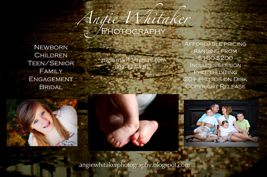
Click to see them larger. It's hard to see what they say in this size, you can get a real feel when you see them bigger.
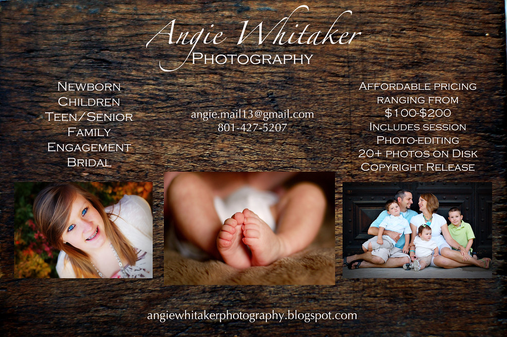
Click to see them larger. It's hard to see what they say in this size, you can get a real feel when you see them bigger.

15 comments:
#2 or #3. (maybe #3) more....
The relection in #1 takes my attention off what it should be. The background (in my opinion) shouldn't be distracting.
Lookin' good!!
I like #2... it's simple and clean.
I like #3's style of background, but #2's darker background makes the pictures pop.
#2. It's simply nice.
Hey there-I am so excited for you to be pursuing this talent more. It looks amazing. My personal preference is #3. I love the wood...I think it is way more inviting too. One suggestion, (living w/Aaron has made me more aware of advertising!) is to take out the prices on the first page? Just put affordable quality pictures or something. Get someone to call first and then you can talk to them about pricing, which is easier.
Any of them are great though. Good luck!!
I like number 2. Good idea about eliminating the pricing. Smart to put a senior pix, a baby, and a family. Good advertising.
I'm all about #2, I agree it makes picture pop out and shows off your talent which is what your trying to to have people see. More catchy to my eye.
Way to go Angie! I hope it takes off for you in CA. You are so talented. I liked the 3rd one. They look great and I think you did an awesome job.
Little Mylie is just beautiful. I can't get over how blue her eyes are! Keep the pictures comin':)
I like #2 best and #3 second! The first one is harder to read. Fun!!
We are coming down your way..to San Diego this next week!!! Would love to see you. Is your cell # the same?? the UT #?
Despite what's been said, I'm going to say this: I really like the first one and think it adds a nice touch and is still legible!(I suppose #2 makes the photos pop out more, but #1 just shows more of your love of photography)
I agree with everyone else - #2 is easiest to read and shows off the photography more. Good Luck! Love you!
I actually really like the first one. It is a little busier but in a good artistic way. You really couldn't go wrong with any of them though. They look great!
i like them all but my fave is number three. it is has a very natural feeling to it without being "naturey" (hey it's a new word!) and i think that your pictures create that same feeling. of course i love them because it has a picture of one of my all time favorite girls on it!!!
I like #2 the best. I am no artist but when I saw #2 I was able to clearly see everything and it just looked real clean to me. Good luck!! See you in about a month!!
Hey Angie! I haven't checked blogs in quite some time and just saw this post. :) I really like #2! Like others have said, the pictures seem to stand out better and it's cleaner. I'm so excited for you!
Post a Comment